visualising-data-course
9: Use colour carefully and sparingly
Use colour sparingly. Take an exception reporting approach
- only show or highlight events that require attention or immediate action. e.g., an outlier
- consider the mantra “Less is more. If in doubt leave it out.”
Some colours have meaning e.g.
- red > danger,
- yellow > freshness,
- green > environmentally friendly
All colours have connotations. For example, red variously means:
- bad / danger in status reporting,
- left-wing in politics (unless you are in the US),
- the enemy in military contexts,
- a loss or price drop in financial contexts.
Hint: use ColorBrewer palettes. Their advice is specifically for maps but it works for most charts. The data can have three scales:
- Sequential: low to high e.g., population density
- Diverging: negative to positive e.g., loss - profit
- Qualitative (also known as Categorical): no order of elements e.g., product type
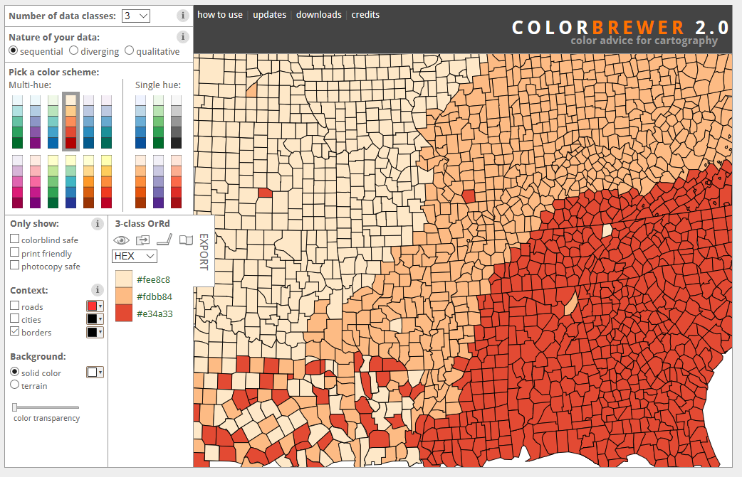
Source: ColorBrewer website
Think about accessibility: e.g., colour blind palettes.
(Contra) Example
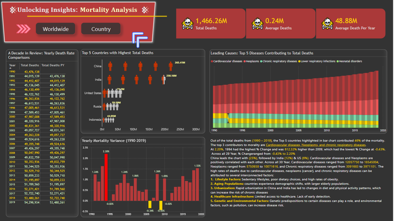
Health Analysis in Power BI Community Gallery Source