visualising-data-course
3: Prose matters
Short clear English for the written elements of a chart can really help understanding.
- Make your point, don’t state a fact.
- Choose the words carefully in the title, subtitle and footnotes of a chart.
- The title states the headline point.
- The subtitle states secondary point.
- The footnotes provide data source links.
- A commentary often follows.
- Label axes clearly. State the units of measure
- Label any legend clearly
- Use lines and annotation to highlight key points and events
Consider following a typical newspaper article organisation:
Headline > bye-line > chart > summary > detail
Always label units. For example, car fuel efficiency: miles per US gallon or kilometres per litre?
Don’t use excessive precision. 2 or 3 significant figures is normally enough. For example:
- £381K is probably better than £381,123.78 and much better than £381123.789
- 20-June-1995 is probably better than 28-June-1995 12:34.567
- 12% is probably better than 12.345%
Example
Inspect the chart below and identify all the prose elements. is prose used effectively in this chart?
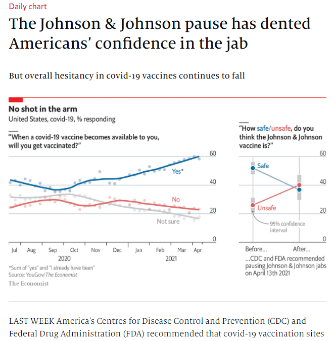
Source: The Economist
Example
This chart has a various textual adornments. How many do you see?
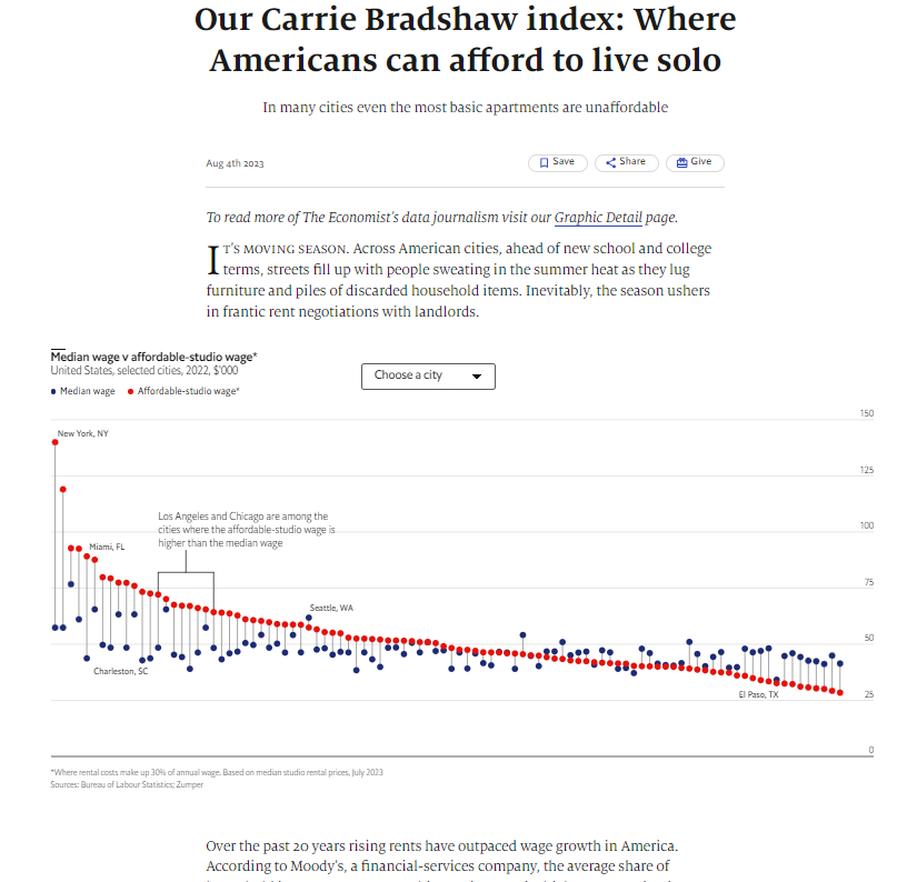
Source: Our Carrie Bradshaw index: Where Americans can afford to live solo (economist.com)