visualising-data-course
5: Favour common visual types
Readers are familiar with common visuals; they have stood the test of time. There are only a few common visuals: bar chart, line chart, scatter plot, card, pie chart. Any other type is an obscure type.
Use variations of common types e.g., dual axis line chart, or use obscure types e.g. Mekko chart, with care.
Visual encodings map numbers into graphic properties (e.g., length, angle, colour). Academic studies suggest that people can perceive some properties much better than others. A famous study, (Cleveland, McGill, 1984) tested how accurately people could perceive values if presented with different graphic properties factors. The results were below - from more accurate to less accurate.
- Position (of a point on a scatter chart)
- Length (bar chart or a Gantt chart)
- Slope (on a slope chart)
- Angle (of a slice of a pie)
- Shape (of a marker on a map)
- Area (of a section of a tree-map)
- Colour
- Text (in a table) Source: McGill/ Cleveland
In brief this suggests people are good at “understanding” visual marks in this order:
position > length > slope > angle > area > colour > written numbers
This may suggest a rough order of preference of visual types to use when appropriate
scatter plot > bar/column chart > bump chart > pie chart > tree map > text table
Example
This scatter plot allows the reader to see when a film was released and how much it made at the box office.
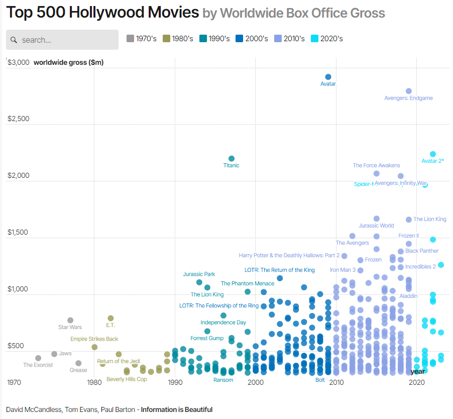
Source: What is The Most Successful Hollywood Movie of All Time? - Information is Beautiful