visualising-data-course
10: Do not mislead or frustrate the reader
Don’t force the reader into unnecessary mental toil.
Keep the visualisation to one page or screen - avoid the need for scrolling / page turning / excessive drilldown.
Don’t mislead, either intentionally or unintentionally. For example, on column charts, start axes at zero.
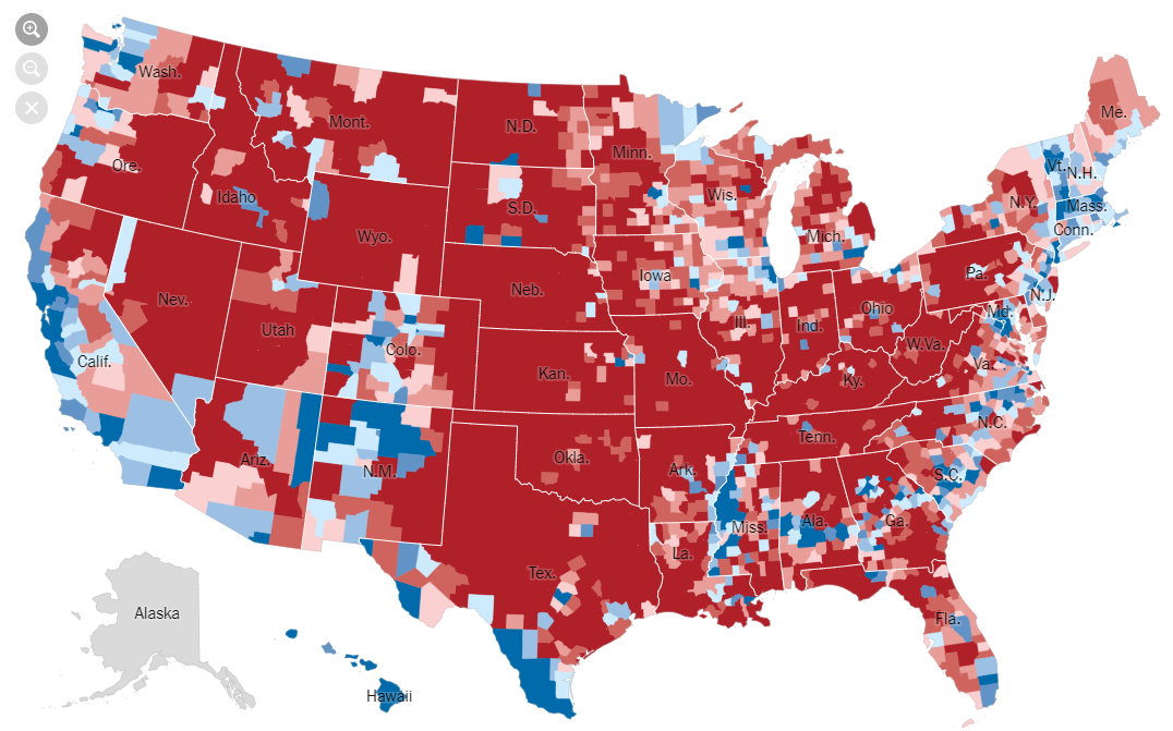
Example: A chart of the 2016 US election results at county level may suggest that the Republicans (red) had a landslide victory over the Democrats (blue).