visualising-data-course
2: Consider your audience
Here are some questions to ask about your audience when starting to design a visual that will improve the end result.
- Who is your audience?
- What is their level of expertise, interest and engagement?
- Do readers have 5 seconds or 15 minutes to ‘get it’?
- What is the purpose? To inform, entertain, persuade, or simply to explore the data?
- Should the visualisation be impartial vs prescriptive?
- How often will the audience look at the visualisation? Once only? As part of a daily or monthly report?
- What channel is used for the visual? Laptop? Mobile? Perhaps a presentation where the author can speak and explain data and insights?
- Should it include what-if?
- Should it include personalisation?
Alberto Cairo’s definitions (journalism background)
Alberto Cairo is a Spanish information designer and a professor of Visual Journalism at the University of Miami. He has a background in data journalism. He has a useful definition of what makes a good visualisation that emphasises the reader (audience).
A visualisation is a graphical representation designed to enable exploration, analysis, communication. A good visualisation is:
- based on good data
- attracts the readers’ attention
- does not frustrate readers
- shows the right amount of data (does not oversimplify)
Alberto’s latest book is How Charts Lie.
Example
This visualisation may appeal mostly to children.
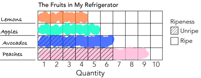
Source: THE KIDS’ TABLE: Draw Along Dataviz , Nightingale (nightingaledvs.com)