SEGRO Courses
Home | Excel | Power BI | Copilot | Visualising Data
Power BI Overview Course Notes
What is Power BI? Is it for me?
Power BI:
- is a business intelligence tool,
- turns data into insight,
- connects to, imports and analyses any data,
- is designed to be easy to get started,
- but has enterprise capabilities under the covers.
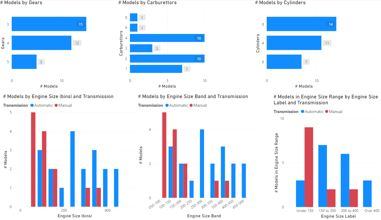
This Power BI report has several bar and column charts.
What can you do with Power BI
Analyse, visualise, publish data and reports
- Import, shape, clean data from different sources
- Build interactive visualisations
- Connect different tables together on a powerful data model
- Calculate interesting results: ratios, year-to-dates,…
- Publish and distribute
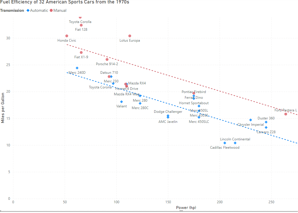
This is a scatter plot created by Power BI.
Power BI vs Excel. Power BI is more:
- Visual: easier to build charts and visualise data
- Interactive: drill down, drill through, filter, cross-highlight, buttons,…
- Shared: report viewers only need a browser such as Edge, Chrome
- Automated and Repeated: e.g., scheduled data refresh
- Structured: data must be in tables; tables are linked together with relationships; there is a powerful calculation language, DAX
- Scalable: 25 million rows easy, 10 billion possible
The next sections show one or two charts to illustrate each of these in turn.
Visual
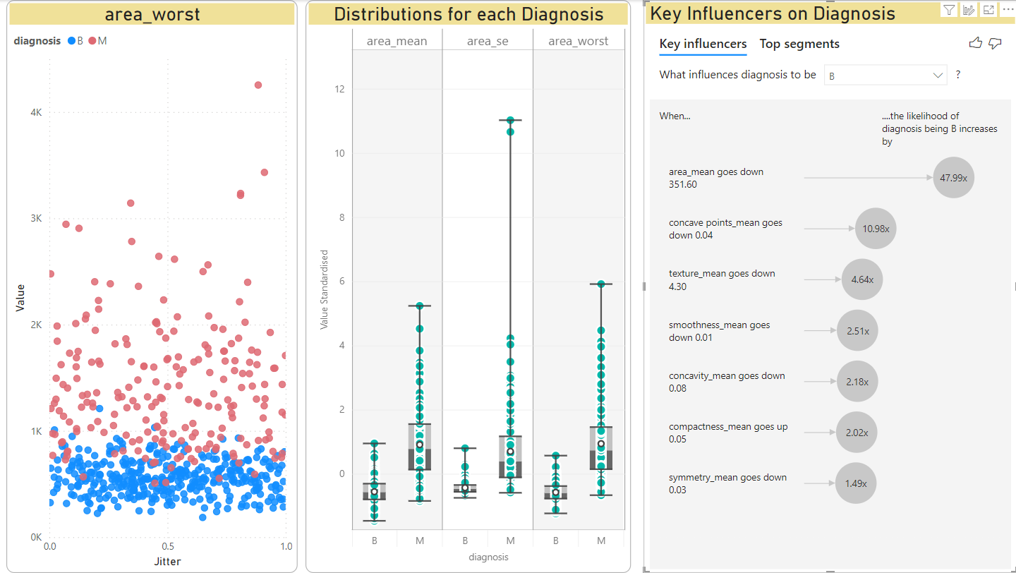
This shows three charts:
- left: a scatter plot
- middle: a box-whisker chart, an unusual custom chart most useful for expert statisticians
- right: a key influencers chart, an AI-assisted chart that uses a logistic regression model to suggest whcih factors (variables) contribute most to a result.
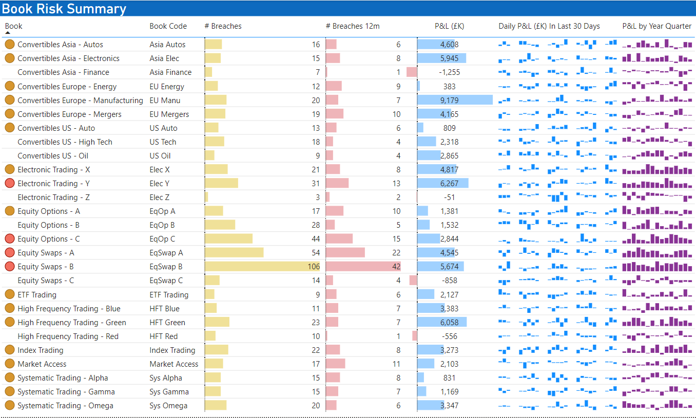
Even when the chart has to be a table of data, Power BI can have visual “conditional formatting”
- icons, that are different colours or shape
- background colours
- data bars
- sparklines, a tiny line/column chart that show the history of the value over time usually
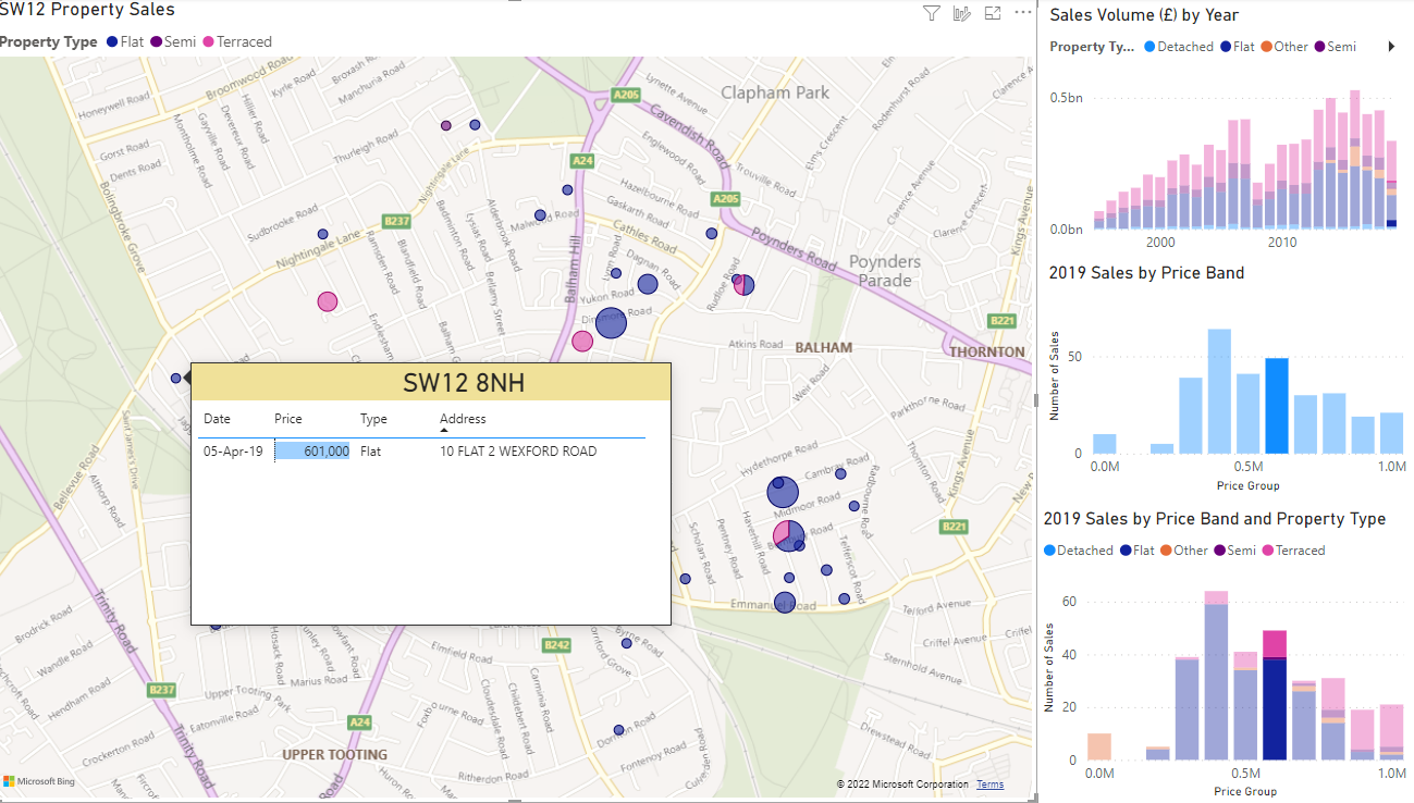
Interactive
Several charts on the same page can interact together. In this chart, the user has selected a price band in the bar chart (right, middle). This filters the map to show only properties in this price band.
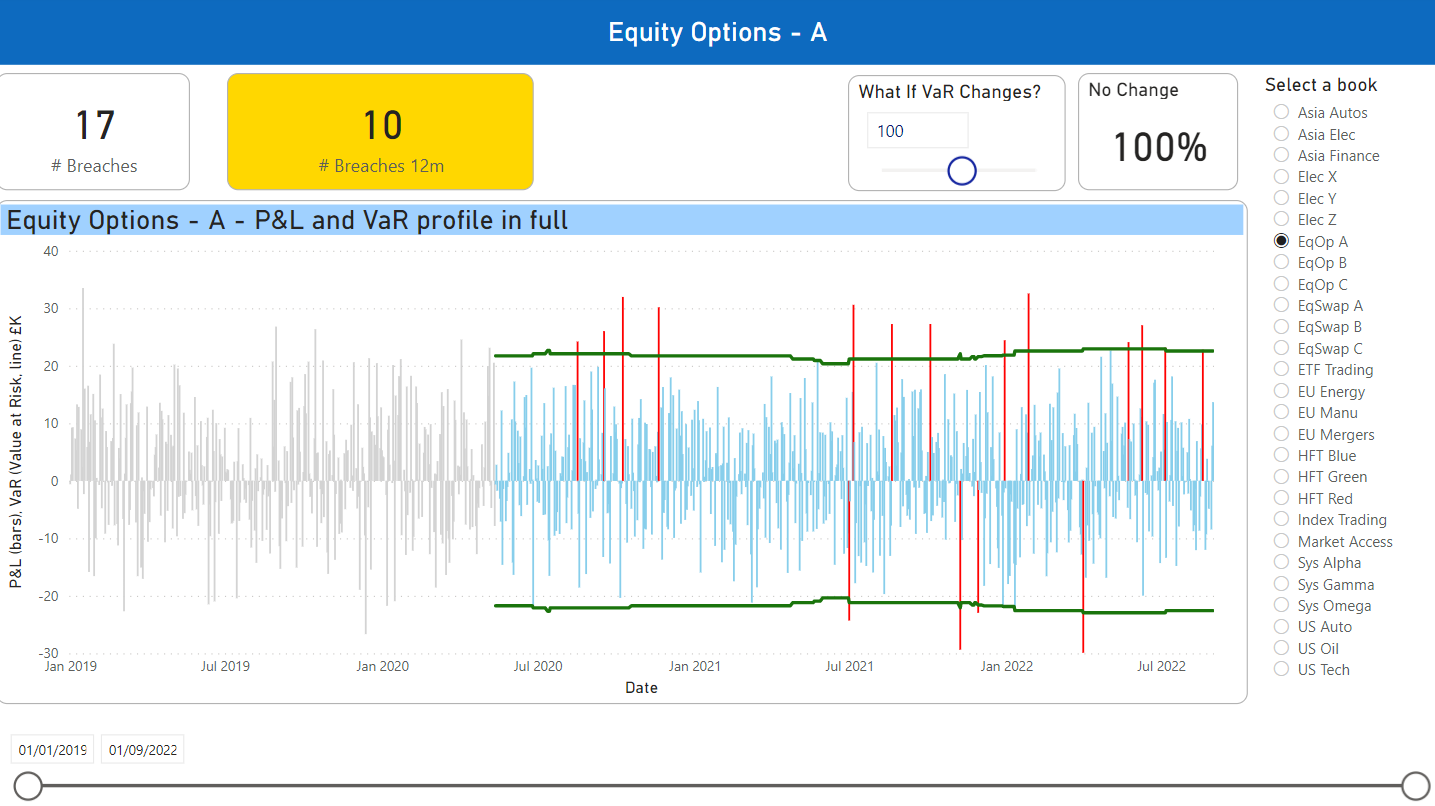
This chart has three interactive features:
- the What-if slider
- the book slicer
- the date range slicer
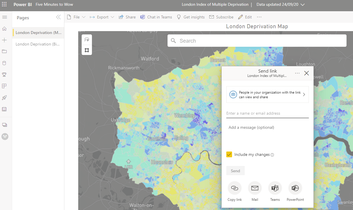
Shared
This Power BI map has been published to the Power BI Service. The user is choosing to share with a colleague. (Unlike Excel, no files need to be emailed or shared on OneDrive.)
Automated
Users can clean and shape data Power BI Query Editor using the user interface.
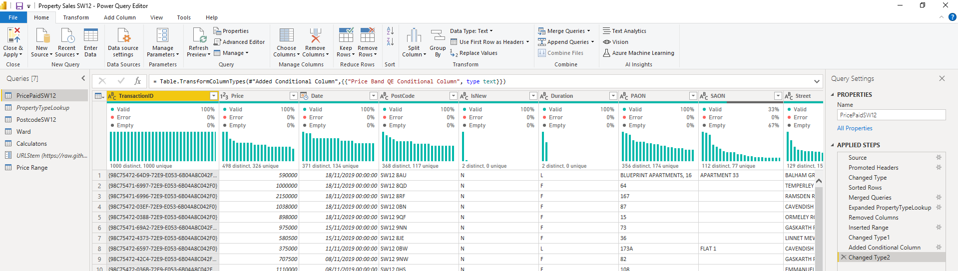
But under the covers, the Query Editor is recording these steps as code. We never need to see or touch this code - it is automatically generated.
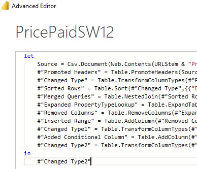
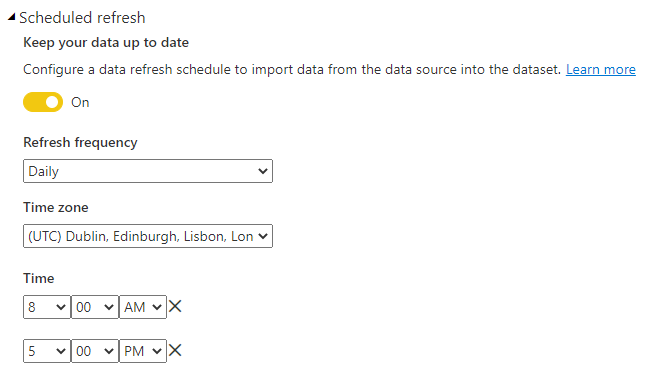
This does mean that when we need to update the data in Power BI, we can simply click a button to refresh the data, and the Power Query code will run. On the Power BI Service, we can schedule this to run several times a day.
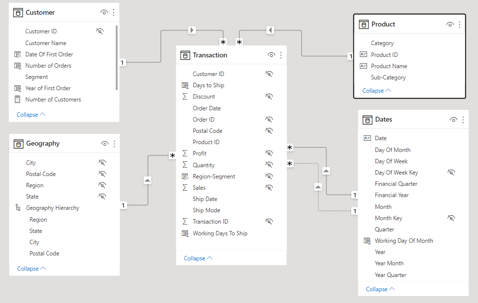
Structured
Unlike Excel, all data must be in a table. This requires more work and design up-front, but from this comes great analytical power.
Scalable
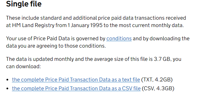
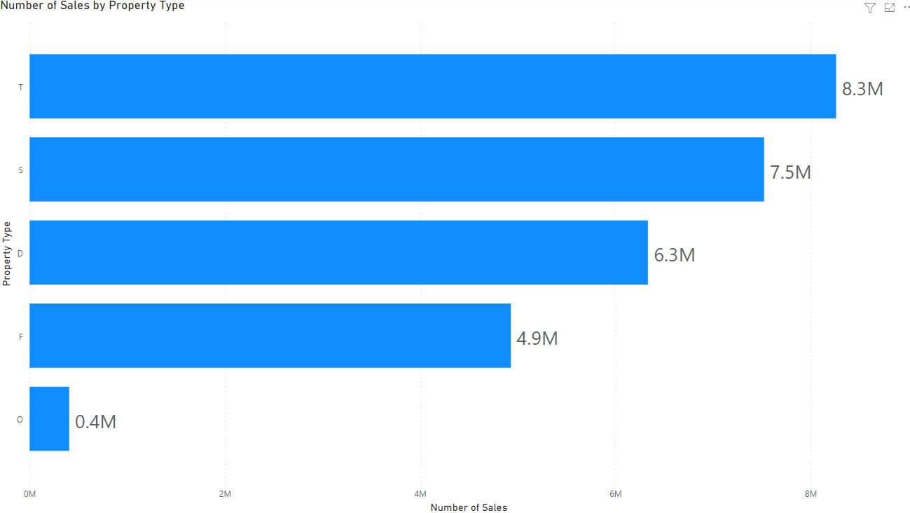
Excel has a theoretical limit of 1 million rows and in reality becomes sluggish with much fewer rows than that. Power BI can handle millions of rows. For example, the snapshots below show the UK Land Registry dataset, that contains 28 miillion rows.
We can import this dataset into Power BI and it will perform well. This bar chart counts the number of sales of properties by type.
Power BI and Excel work well together
Examples
- Excel can create pivot table from a published Power BI dataset
- Power BI can export data to an Excel file
- Power BI can import data from Excel sheets, and from Excel tables.